There was a tiny little controversy—not even as much as a tempest in a teapot—over my decision to offer a fine print of Dorothea Lange's "Migrant Mother" two weeks ago. A few people worried it might not be legal (it is) or ethical (it is) and a few others opined that it wasn't quite the right thing to do anyway (I disgree, but hey, fine, they're entitled).
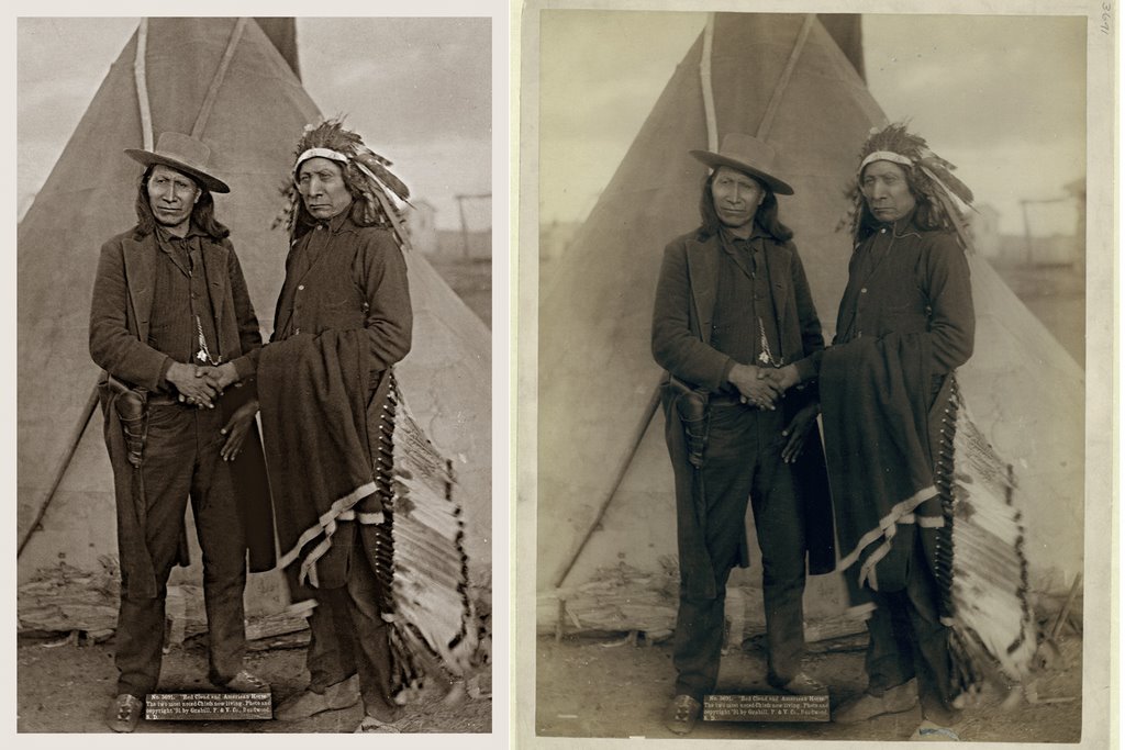 John C. H. Grabill, Red Cloud and American Horse
 (Click on the image to see a larger version)
The thing is, pace Ansel Adams, a print really is a performance. Take a look at this pair of pictures. The photograph is by John C. H. Grabill, and it's entitled "Red Cloud and American Horse, the Two Most Noted Chiefs Now Living." That was in 1891. Ansel said the negative is the score; in this case, the score is a TIFF filed downloaded from the Library of Congress website, which is on the right. On the left is a small JPEG of an in-progress file I've been working on to make a print out of. It's not finished yet. It may not get finished, either: the TIFF file is a so-so scan of an old, damaged print. The print, like most photographs, was not particularly well-made in the first place, and it shows all sorts of defects: water damage, metalizing, discoloring, fading, and a maddening number of flaws—some in the original negative, some in the original print, some in the scan, some not showing up except in my contrast-enhanced rendering of the scan. I worked on and off for two days on spotting the #$%! thing. There's still some left to do.
Now, I suppose, one could ask just what the heck it is I'm doing, and what it is I'm making. It's not an original anything, certainly. A restoration? A pointless little prettied-up pictorial simulacrum of the original? Maybe you like the charms of the original in all its damaged glory—fine, but remember, you can't have the original. It's in the Library of Congress collection. All you can have is a digitized TIFF, or a reproduction print made from something like the version on the left, whether you let me do all the dirty work or you do it yourself. So would you make an inkjet print of the file on the right and hang it on your wall? I don't think I would. (I might hang the original, if I could.)
What I think I'm doing, anyhow, is this: printmaking. I like printmaking. I like it because I like to look at prints. If I spend five hours of my life re-working a nasty old TIFF from the LoC, it's because I like the picture and want to look at it more often, that's all.
The argument could also be made that what's being done is rescuing. Sure, nothing you can download from the LoC website is literally in need of rescuing—except perhaps from obscurity, from being overlooked, forgotten. (Had you ever seen Grabill's portrait of Red Cloud and American Horse before? I hadn't. I've known about and admired Red Cloud for a long time, though.) There are tens of thousands—hundreds of thousands—maybe millions of fine old photographs languishing in archives, museums, libraries, historical societies, and estates all over the world. I could work for the rest of my life on making prints of pictures just from the LoC collection, and never make a dent. Why not resuscitate a few nice ones for a frame on the wall of a few of the more discerning households here and there?
So, you're saying, fine and dandy—but what the heck has all this blather got to do with "Migrant Mother"? It's a very famous photograph and doesn't need rescuing from anything. The answer there is...well, not to be immodest, but I'm good at this. Not the best, mind you—I'm not that immodest—just very good. At printmaking, I mean. And this is where interpretation comes in. I like interpreting pictures as prints—performing them, Adams would have said. Running them through my own aesthetic filter, putting my stamp on them, eking out their expressiveness, finding the balance I think is just right.
Let's take Migrant Mother, for example. I'm going to exaggerate these two details, to make my point, but I think you'll see what I'm talking about.

Take this detail first. It's Florence Owens Thompson's face, rendered in fairly low contrast. Now look what happens when I increase the local contrast:

The change is slight, and either one works fine technically. But the higher contrast version changes her expression. Are you seeing that? Yes, it's the same exact information—but it feels subtly different. Look at them together. In the top picture, she looks more resigned, forebearing. In the bottom one, she looks more worried, more anxious, maybe even a touch angry.
It's easy to analyze why: the higher local contrast emphasizes both the lines in her forhead and her upper lip. By darkening the upper lip, her frown is emphasized; her mouth in the top picture could almost be of a mouth in a resting attitude, whereas the bottom one seems more like an active expression, actively displeased. And bringing out the lines on her forehead makes her worry more exaggerated. It's a subtle thing, but it's definitely something any viewer would sense in looking at a fine reproduction.
This isn't a technical issue at all, really. It's pure interpretative. In making a print I'm not thinking how I want the contrast to look, I'm thinking "what makes her expression the most eloquent?" I don't want to overcook the local contrast on her face, because then, sadness and worry overwhelms stoicism and forebearance, and you don't want it to. All those elements should balance: it's what give her face in the picture such tremendous richness. It's not just a matter of the contrast, it's a matter of the effects of the contrast.
In my version of Red Cloud and American Horse, for instance, I'm just not feeling the cold and the wind of the prairie quite as much as I do from the original. It seems a little too flat, a little too pretty. Is it too brown? I'm going to have to figure that out.
Well, anyway—maybe now you'll understand when I tell you that I've been agonizing all day over whether to make the final version of Friday's print five inches wide or five-and-a-half inches wide. Slightly smaller, and it has more of a gem-like quality (I even like it smaller still; it works). Slightly larger, and you see just slightly more film grain, which I like. But a little more sharpening shows the grain too. Gotta find that perfect balance where everything's just so and the whole thing sings....
Posted by: MIKE JOHNSTON
Featured Comment by Robin Dreyer: I don't see any ethical problems here—I'm just glad to see someone recognizing photographic printing as printmaking. I love to print—I have friends who are printmakers in the classical sense (i.e. etching, litho, etc.), and I've always seen a connection between what they do and what I do. I also supervise the printing of publications, and when I work with printers, I'm aware that they, too, are printmakers. What ties these things together is the shifts and the interpretations that happen when an image is translated from one material to another. It's printmaking.
No comments:
Post a Comment